

Welcome to our collection of ready-to-deploy Power BI dashboards designed to fast-track your data visualization needs. Our prefabricated dashboards offer a hassle-free solution, allowing you to access critical insights and visualize data in a matter of minutes.
Why Choose Our Prefabricated Dashboards?
Time-Efficient: Save time and resources with pre-built dashboards ready for immediate use.
Cost-Effective: Affordable solutions without compromising on quality or functionality.
Tailored to Your Needs: Select templates that align with your industry and customize as needed.
Streamlined Analytics: Simplify complex data into actionable insights effortlessly.
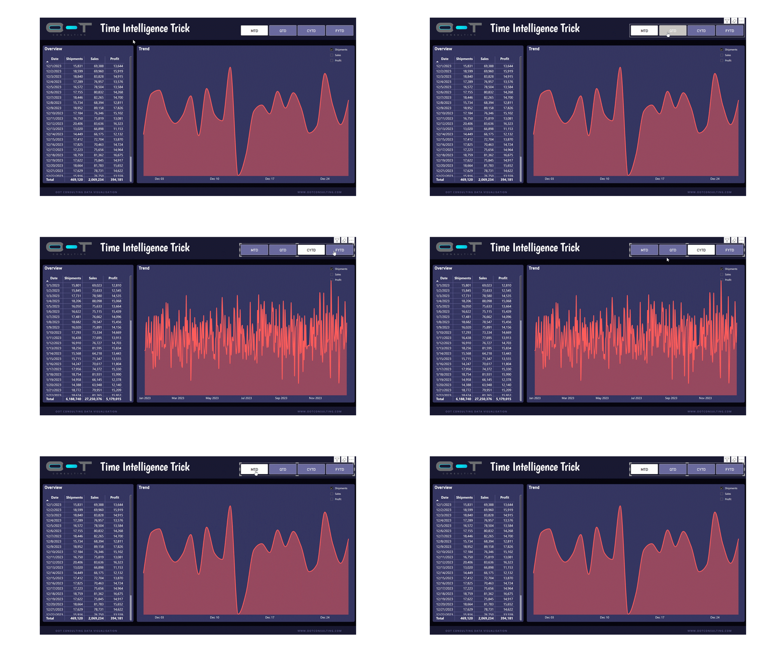
Whether you are tracking sales growth, monitoring inventory levels, or predicting market trends, Time Intelligence in Power BI empowers you to navigate your chronological data with unparalleled agility and insight.

Overview:
Calculation Groups in Power BI allow you to apply a single calculation across multiple measures without the need to create additional calculated columns or measures. This not only saves time but also enhances the manageability of your data model.
Capabilities showcased in this report:
Calculation Groups
Time Intelligence
Dynamic Formatting String


Overview:
This document contains the business's core processes and practices within Sales & Operation Process (S&OP).
In this playbook you will find all the relevant meetings, Objectives, KPIs, Reports, Tools, stakeholders, Inputs & outputs in the SOP process.
With this information you will be able to compare to your process or to implement the SOP from scratch in your organization.

Overview:
This roadmap contains a comprehensive list of 40+ use cases, 180+ Requirements and 300+ business capabilities relevant for Demand Planning, Supply Planning, Inventory Management, Procurement, Materials Requirement Planning, Quality Control Process and Production Scheduling.
If you are trying to move from descriptive analytics to advanced analytics or transitioning to a new ERP or Planning System, then this guide will help you expedite the requirements and functional specifications.

Overview:
How do you know if your stock on hand can cover the next X weeks?
Do you know your ending inventory based on your initial stock and your weekly demand?
Are you able to identify the main drivers that are contributing to stock outs?
This solution in Power BI tackles the aforementioned questions
Metrics:
WoC: Weeks of Coverage
Weekly Demand: average of Total Demand based on select No. of periods
Min Inventory based on select No. of periods
Inventory Health buckets:
Very low coverage (<1 wk)
Low coverage (1–2 wks)
Healthy coverage (2–5 wks)
High coverage (5–12 wks)
Very High coverage (>12 wks)
Features:
This tool is capable to tell you how healthy your inventory is based on ABC classification and the Inventory Health buckets.

This is a personalized, expert-led service designed for individuals seeking to master Power BI, the renowned data visualization tool. This service offers a unique opportunity for clients to engage in one-on-one sessions with a certified Power BI professional. Tailored to each individual's skill level and goals, the coaching covers a comprehensive range of topics, from the basics of data modeling and visualization to advanced techniques in data analysis and report creation.
Duration: 1 hour
After the payment is received, you will receive an email from success@ootconsulting.com to set up the call at a convenient time.
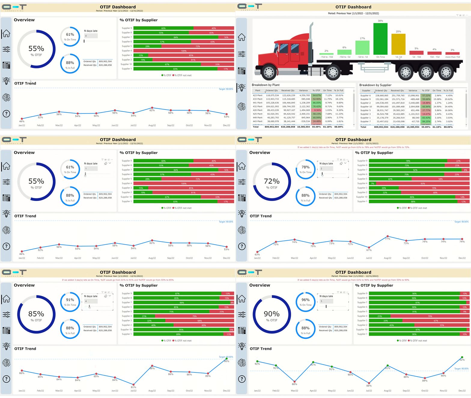
Overview: Introducing our On-Time-In-Full (OTIF) Dashboard: A Comprehensive View of Operational Excellence!
Our OTIF Dashboard is your gateway to understanding and optimizing the critical metrics of On-Time Delivery (OTD) and In-Full Delivery (IFD). This powerful tool offers a holistic view of your operational efficiency, ensuring that your products reach their destination on time and in the expected quantities.
Metrics: On-Time Deliveries, In-Full Deliveries,
No. of screens: 5
Business Capabilities and Features:
What-If scenarios to simulate late deliveries as On-Time deliveries.
App-like look and feel.
Infographics
Main drivers that are contributing (negatively and positively) to the overall result.
Heatmaps
Drilldown
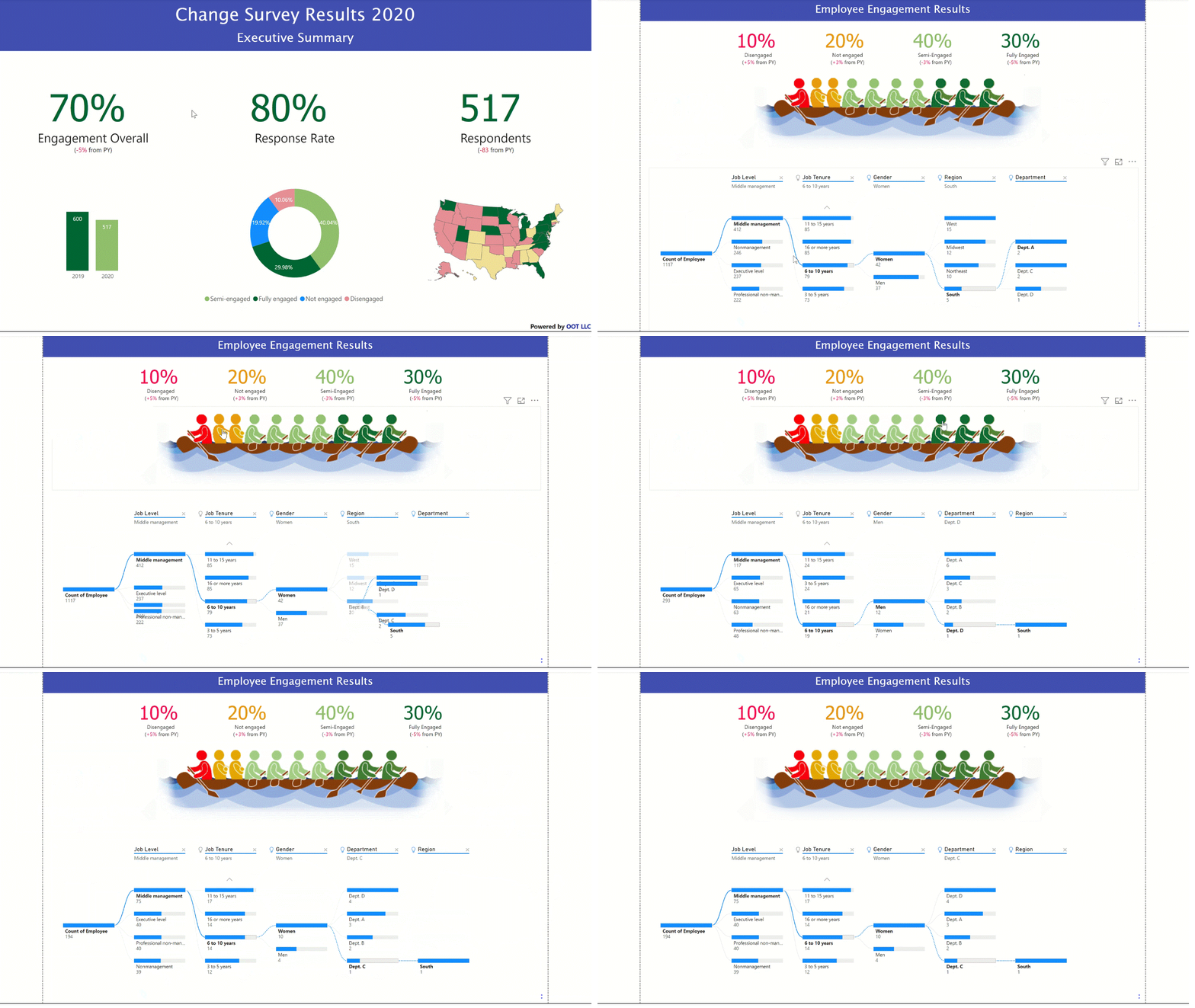
Overview: This Dashboard made on Power BI aims to help you to slice and dice the results of an employee engagement survey. With this template you will be able to analyze your results more efficiently.
Metrics: Sentiment Analysis
No. of screens: 2
Features:
This Dashboard has a custom visual to select categories based on sentiment analysis.
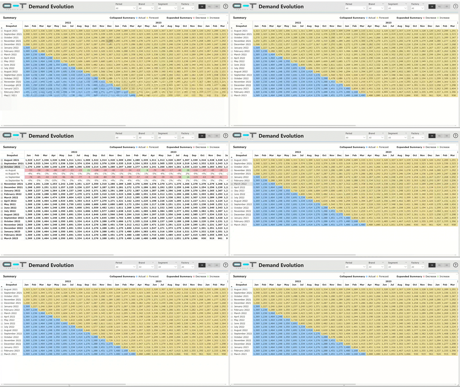
Overview: Our Demand Evolution Dashboard is one-click dashboard to get to know the changes in the demand plan. This user-friendly dashboard helps you understand the changes between two snapshots at different granularities.
Metrics: Current Forecast, Previous Forecasts, Actuals (Shipments), Variance, Variance %
No. of screens: 4
Business Capabilities and Features:
Historical Demand Analysis: Visualize historical demand patterns over time, allowing users to understand past trends, seasonality, and fluctuations in demand.
Forecasted Demand Comparison: Compare forecasted demand against actual demand, enabling a clear view of accuracy and deviations to fine-tune future predictions.
Customer Behavior Insights: Gain insights into customer behavior and preferences that influence demand, enabling targeted marketing or product development strategies.
Customizable Reporting: Customize dashboards and reports to fit specific user needs, allowing users to focus on key metrics and tailor visualizations to their requirements.
Dynamic Top / Bottom N variances
Demand Bridge
Root Cause Analysis with Reason Codes
In-page Q&A
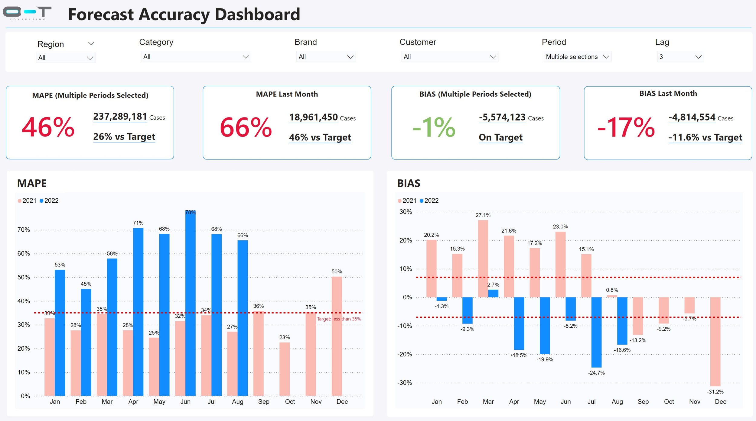
Overview: Our Forecast Accuracy Dashboard is the ultimate tool designed to empower your strategic decision-making process by providing in-depth insights into your forecasting performance. This cutting-edge dashboard is a comprehensive solution tailored to help you evaluate and optimize your forecasting accuracy with ease.
Metrics: MAPE (Mean Absolute Percent Error), BIAS (persistent forecast error), MAD (Mean Absolute Deviation), Tracking Signals, MSE (Mean Square Error), RMSE (Root Mean Square Error).
No. of screens: 7
Business Capabilities and Features:
Performance Metrics Overview: A concise summary showcasing essential metrics like MAPE (Mean Absolute Percentage Error), MPE (Mean Percentage Error), RMSE (Root Mean Square Error), allowing an immediate understanding of overall accuracy.
Granular Accuracy Analysis: Dive deep into specific forecasts or segments, enabling detailed examination of accuracy at various levels—product lines, regions, time periods, etc.
Forecast Error Distribution: Visual representations of forecast errors, histograms providing insights into the distribution and frequency of errors across different periods.
Trend and Seasonality Insights: Identification and visualization of recurring patterns or trends within data, helping to adjust forecasts accordingly and reduce error caused by seasonality.
Outlier Detection: Highlighting anomalies or outliers in the data that might impact forecasting accuracy, allowing for corrective actions or adjustments in the models.
Drill-Down Capabilities: Navigate from high-level summaries to more detailed views effortlessly, facilitating a deeper understanding of accuracy drivers and insights.
Customizable Reports: Tailor dashboards or reports to suit specific business needs, allowing users to focus on critical metrics relevant to their decision-making.
Your All-in-One Toolkit for Beautiful Power BI Dashboards
Tired of inconsistent, cluttered, and hard-to-navigate Power BI dashboards?
This Design System Framework is built in Figma to help Power BI Developers, Data Analysts, and BI Enthusiasts create professional, visually stunning, and user-friendly dashboards—without wasting hours on design!
Why You Need This Framework
✅ Streamlined Dashboard Creation – Save time with pre-built templates, styles, and UI components tailored for Power BI.
✅ Consistent and Professional Look – Ensure design uniformity across all your reports with a scalable design system.
✅ Optimized for Readability & UX – Crafted using best practices in data visualization and dashboard design.
✅ Customizable & Flexible – Modify colors, layouts, and typography to match your brand or reporting standards.
✅ Built in Figma – The industry-leading design tool makes collaboration and prototyping seamless.
Who Is This For?
Power BI Developers looking to improve their dashboard aesthetics.
Data Analysts who want to present insights more effectively.
BI Enthusiasts eager to build polished and high-impact reports.